Hummingbird High’s Kitchen Remodel, Pt. II: Inspiration
This is Part II of my three-part renovation diary for my kitchen remodel last summer. I wrote this post while the kitchen was being demo-ed, but never got around to publishing it until now. Oops. In this post, I talk about planning the new kitchen and discuss design ideas. To see pictures of my kitchen before the remodel, check out Part I: Before the Remodel.
When I first started thinking about the aesthetic for my new kitchen, I knew that I wanted a design that wouldn’t stick out like a sore thumb when compared with the rest of the century-old house (the house was built in 1912). But that was it. Since this was my first house and my first major renovation, I was trying to stay as open-minded and flexible as I could be.
Naturally, I turned to Pinterest and started a board to keep track of the styles I was drawn towards. Pretty soon it became apparent that I was leaning towards a particular look — white cabinets and subway tile, paired with butcher block countertops:
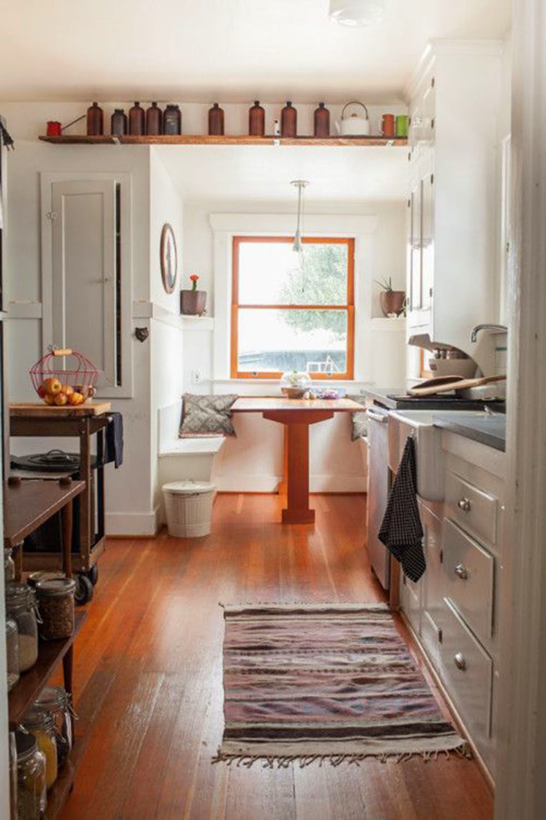
My current kitchen, which was last renovated in the 1950s, has tile countertops. The tile is stone-hard and especially awful on our plateware — over the last year, I’ve had more plates, cups, and glasses broken because of it. I was drawn to butcher block since wood promised to be softer than the tile, and I loved the fact that it could potentially be used as a cutting board. Plus, I could pretend I lived the kind of hipster/prairie farm/matte life that they lived in Kinfolk! Yessss.
However, the more I researched butcher block countertops, the more I realized they were pretty high maintenance for an everyday kitchen. Remodelista warned that butcher block countertops required oiling at least twice a year, while The Kitchn warned of mold problems and water damage. Since both Erlend and I are quite messy in the kitchen, I realized that butcher block would require too much upkeep, one that I would most likely be too lazy or absent-minded to maintain. I sighed and accepted that my dreams of living the Kinfolk life wouldn’t be happening with this remodel.
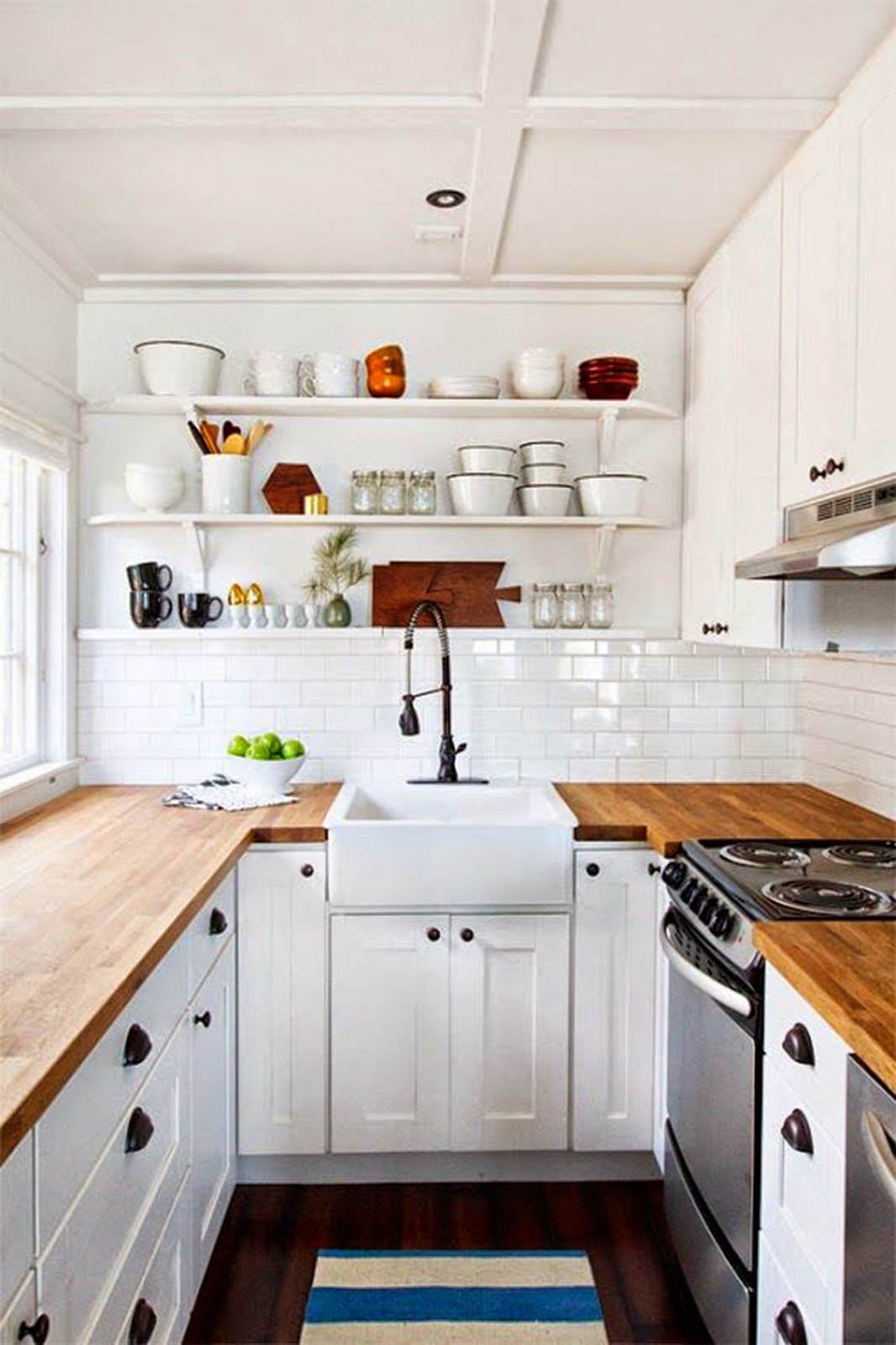
Looking through my Pinterest board, I noticed that the second style I was drawn towards was that of all white everything (cabinets, subway tile, beadboard and walls) paired with marble countertops:
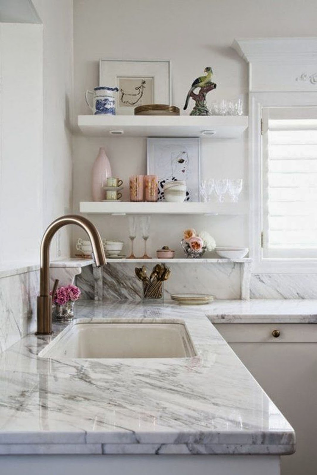
Unfortunately, marble countertops are even more high maintenance than butcher block countertops! Marble is notorious for being incredibly porous and absorbing basically anything that spills on it — water, oil, wine, you name it — leading to stains on your countertop. Yikes! It’s also not very temperature friendly and has a tendency to crack if a hot pan is placed on it. Sigh.
When I showed my kitchen designer the image above, however, he shrugged. “Why don’t you check out quartz? They make some great quartz countertops that look like marble, minus all the fuss.” Indeed, the Kitchn confirmed: quartz was environmentally friendly, non-porous, and stain-and-crack resistant. I was sold. He showed me some options for a quartz countertop that would emulate the marble that I admired so much: Caesarstone’s Frosty Carrina and London Gray. While the Frosty Carrina was a warm white, London Gray was a cooler, very pale gray.
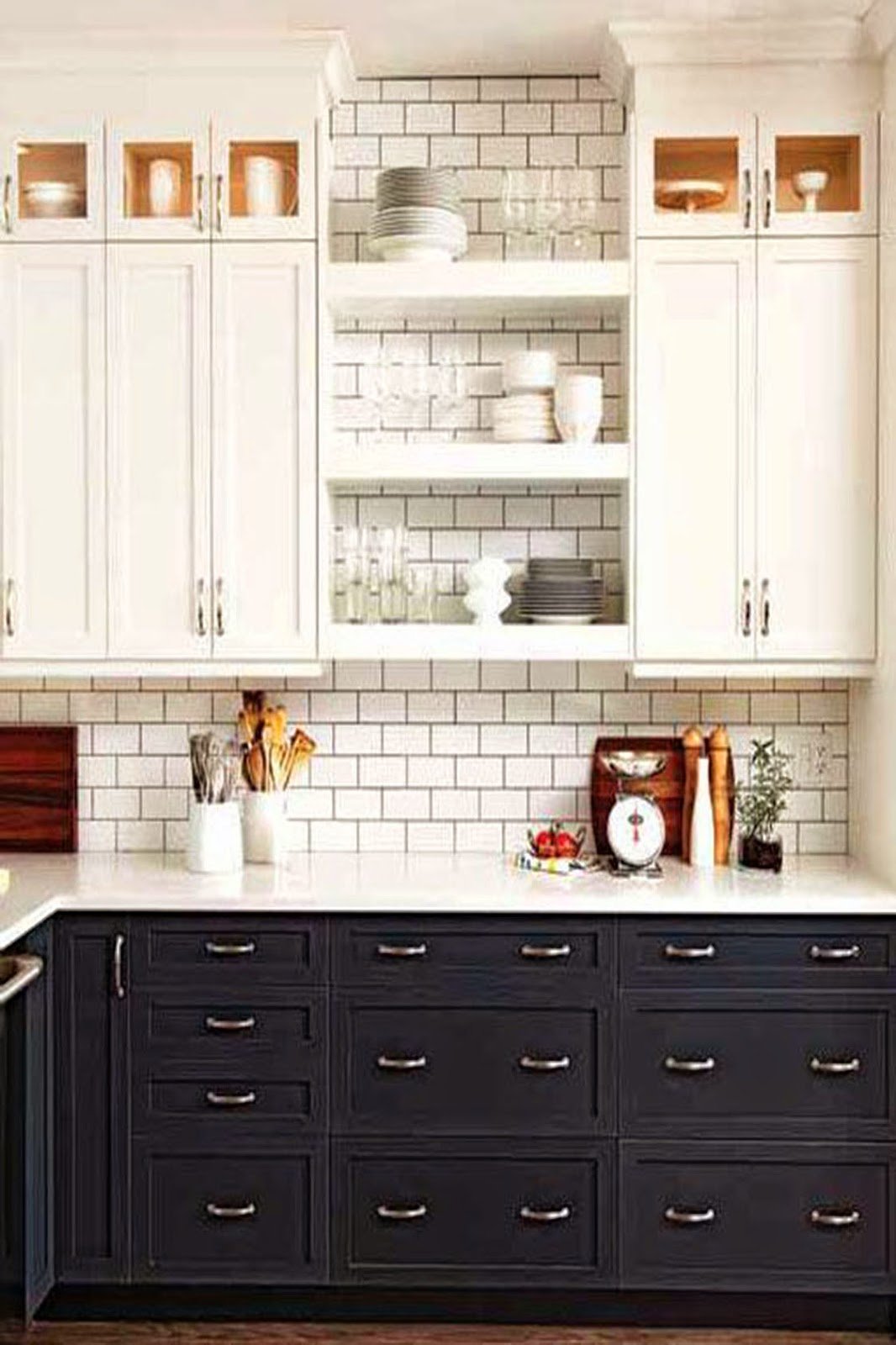
I couldn’t decide between the two colors, my designer suggested that I make the decision based on my cabinet colors. At this point, I was 100% sure that I wanted white cabinets, no matter what. My only hesitation was that I was very drawn to some of the two tone cabinet look that I’d been seeing on Pinterest, where the bottom half of the kitchen is one color, and the upper cabinets are another. I just love, love, love the contrast between the bottom dark cabinets and the lighter upper cabinets:
My big concern, however, was that my kitchen doesn’t really get a whole lot of natural light. It’s this weird L-shape where the main area with the range and fridge only has one window. Although the window is admittedly large (and thankfully, placed above the kitchen sink), it just does not let enough natural light in. With dark cabinets and a dark doug fir wood floor, I worried that the kitchen was in danger of being a dark cave.
My kitchen designer, however, suggested a great alternative — go lighter. “Two tone cabinets don’t necessarily have to be just black and white,” he said, placing some light gray paint chips in front of me. “Why don’t we consider white cabinets up top with a dove gray at the bottom? The light gray will look great with the London Grey countertops.”
Instantly, I fell in love with this idea. I even found a picture on Pinterest that matched the look he suggested:
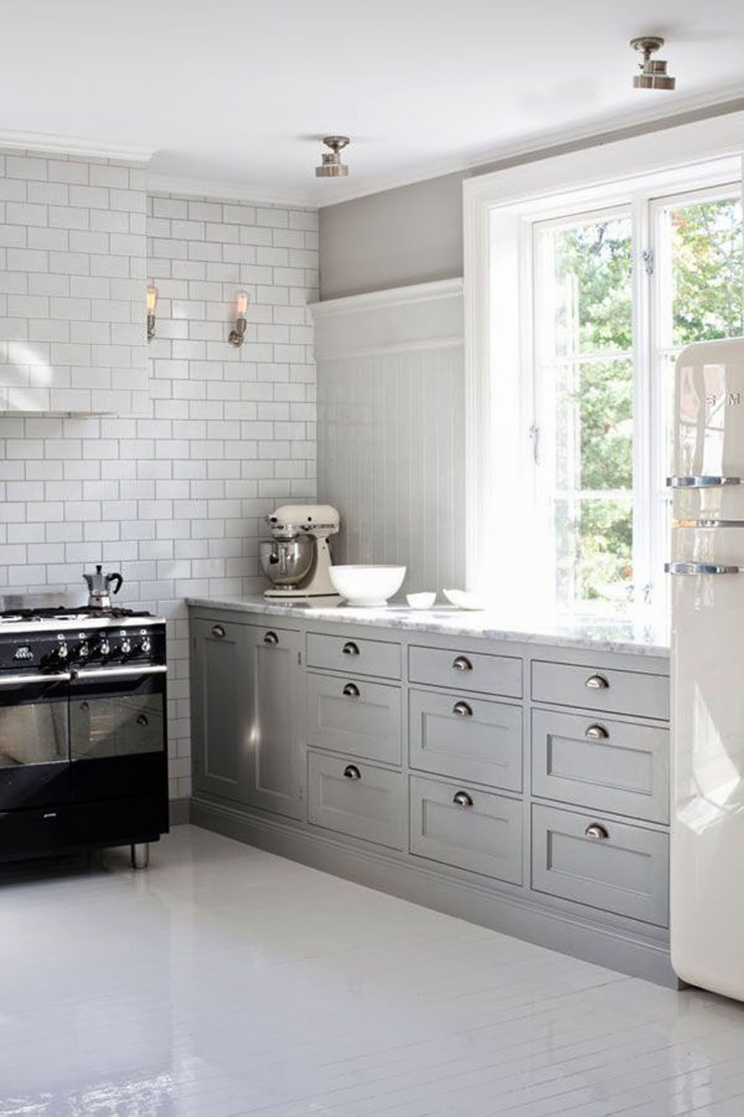
Of course, my kitchen is nowhere near as big and airy as that picture, but at the very least, I was going to have that color scheme. SQUEEEEE.
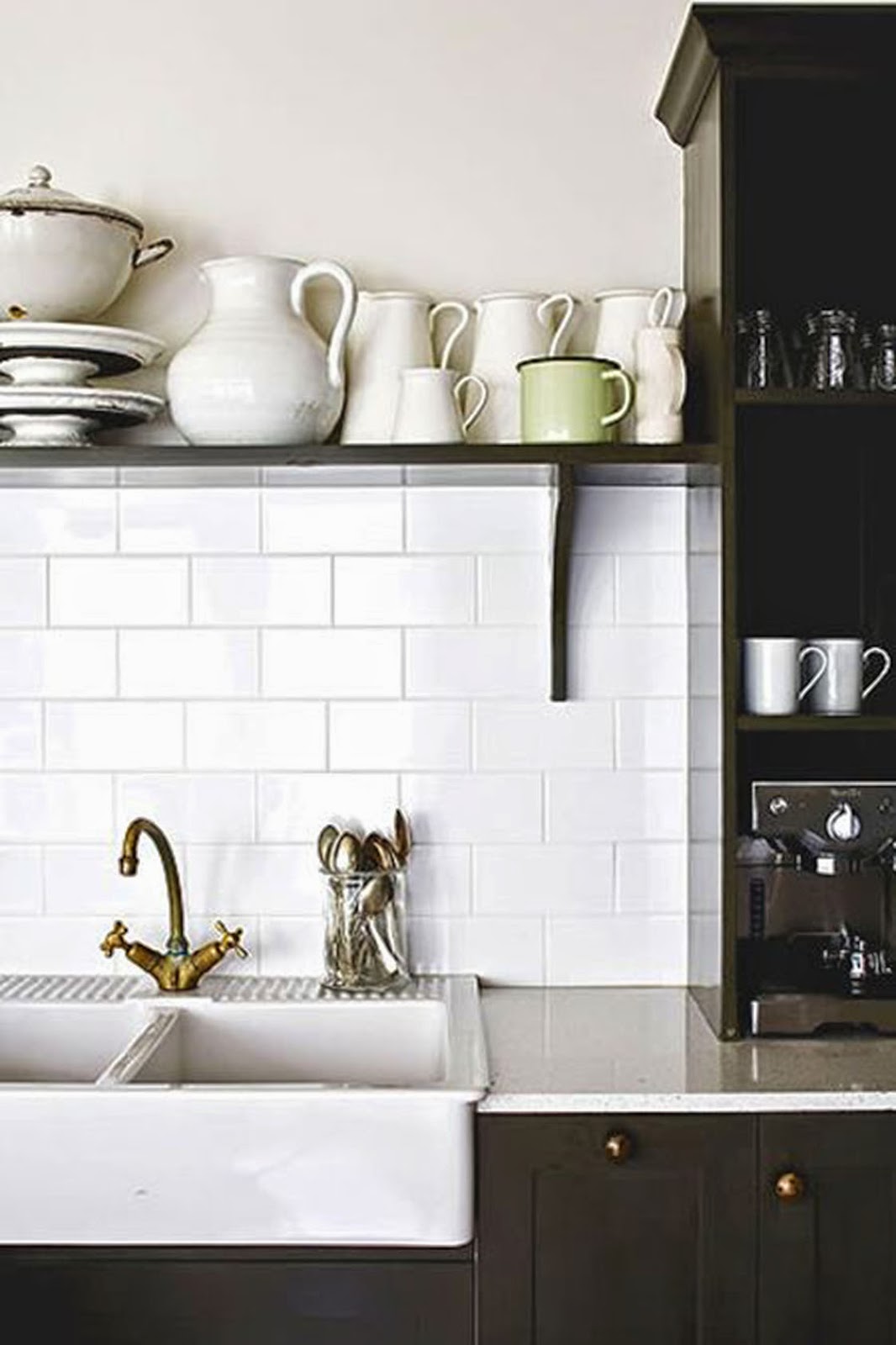
To go with the dove gray and marble look-alike countertops, I decided I wanted a classic white subway tile backsplash and a matching white farmer’s sink. Because as I was putting together my Pinterest inspiration board, it quickly became apparent that I was drawn to this sort of look again and again:
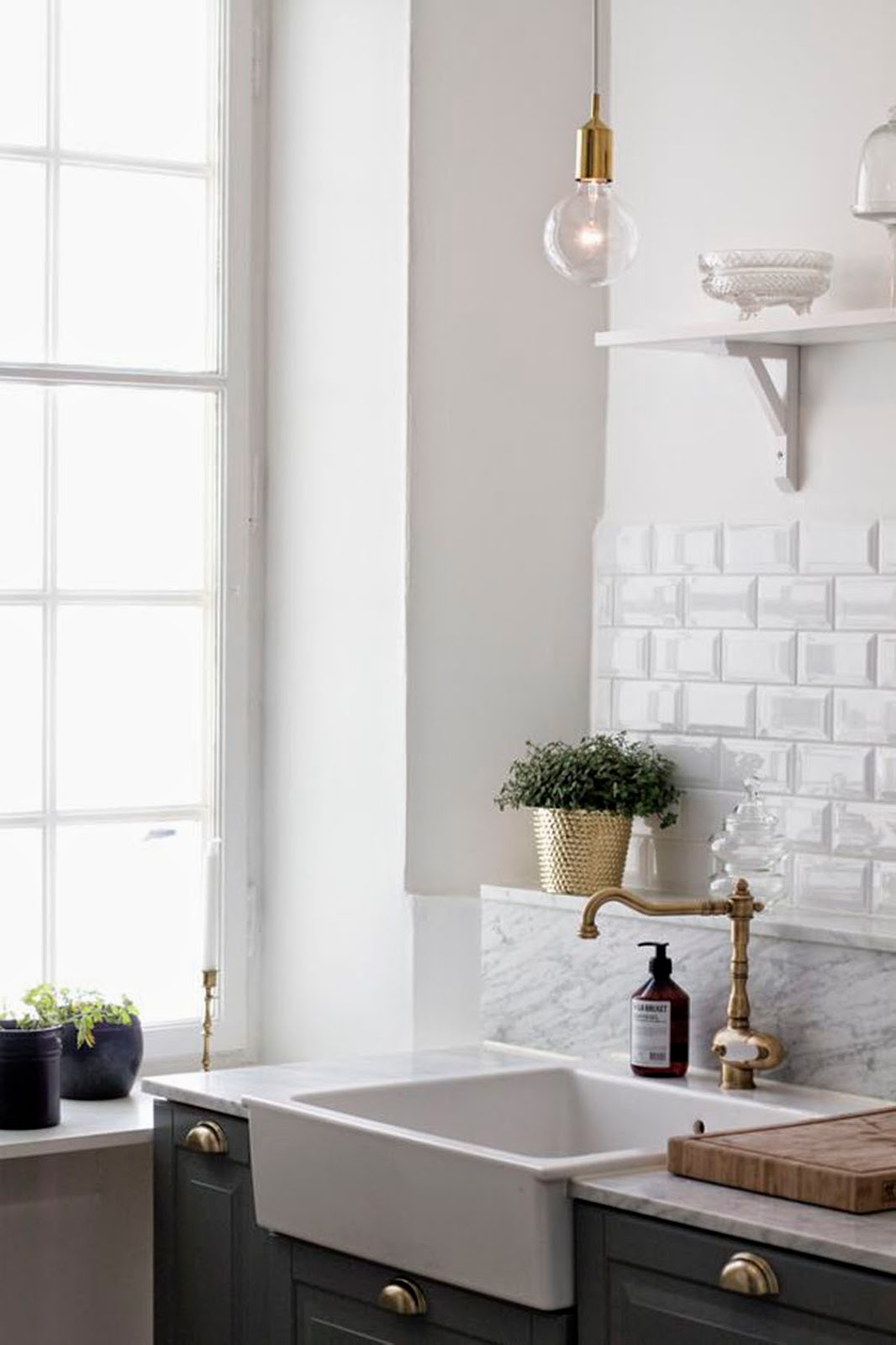
Consciously, I always knew that I also wanted a design that would be timeless enough where, if I sold the house ten years down the road, the prospective buyers wouldn’t wrinkle their noses and go, “Ohmagawd, this kitchen is soooo 2014!” As far as backsplashes go, subway tile is pretty timeless and probably one of the least offensive choices I could make.
The farmer’s sink, however, is slightly more divisive — it’s certainly one of the hippest and hottest kitchen accessories at the moment. More worrisome is that I heard mixed reviews about it from two of my trusted blogger friends. Molly warned me that the pretty white needed a LOT of cleanup since it has a tendency showed every stain and crumb, while Steph emailed that the porcelain material was particularly hard on her plateware. I was heartbroken! I’d lusted after this double bowl farmer’s sink from Ikea for so long, that I wasn’t sure what to do next. It’s still something I’m currently figuring out.
And finally, one of the things I hoped to do with the kitchen remodel was to open it up a little bit. As I mentioned earlier, the kitchen is a bit of an awkward L-shape, with two windows in the nook and one window in the main area. Unfortunately, there’s a weird archway between the two, preventing a lot of natural light from coming into the kitchen area. One of my priorities was to knock this wall down and open up the kitchen as much as I could. I would then build a built-in breakfast nook, and the whole kitchen would look something to the effect of this: